Gerhard Richter, born in 1932, is a contemporary German artist that primarily works in the medium of painting. Many of his works are a reaction to photography; he will project a photographic image on his canvas, trace it out and paint it in accurate colours, and then manipulate the still-wet pigments with soft brushes and squeegees. The results are images that look very similar to photographic blurs, while showing the artist's hand and revealing the nature of the paint itself. His manipulation of wet paint extends to his abstract works, where he paints many layers of colours on a canvas and scrapes it away, revealing the many layers underneath and blurring the colours together.
In 1974, he produced a series of canvases which explore colour. Similar to the works of Ellsworth Kelly, he painted squares of pure colour of a huge breadth of shades and hues in a grid formation, randomly arranged. The result looks like a pixelated image:

4096 Colours (1974)
"4096" is, of course, 16x16x16, and is the hexidecimal system of colours, used in computers.
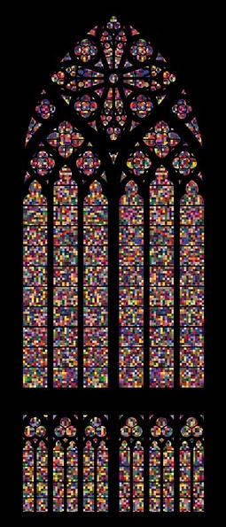
30 years later, he was commissioned to replace the glass in the Cologne Cathedral's main window; during the Second World War, its stunning stained glass was shattered during Allied bombings of the city. This is what he delivered:

From the NY Times:
an abstract composition of 11,500 identically sized units — at 14.5 square inches each, they are frequently compared to pixels — in 72 colors, the arrangement of which was determined randomly by a computer program. Richter originally produced two drafts for the window, each portraying the Nazi execution of innocents. But he ultimately concluded that “figurative” was something he simply could not do. “I was not able to make something of it,” he says. Any representational image would have been tiresomely dissected for meanings religious, political, symbolic. There were also more mundane reasons. As the cathedral’s master builder, Barbara Schock-Werner, writes in a catalog essay for the window, “How could such a depiction be realized other than in gloomy, oppressive colors?” This was not a frivolous matter of interior decoration but a practical concern: the prismatic 1,200-square-foot window would bathe the cathedral (and congregation) in a significant amount of light.
So Richter, who provided the work as a gift, ultimately settled on a design inspired by his 1974 work “4,096 Colors” — one in a series of abstract color-field paintings he has worked on in various forms since 1966. About his process he noted: “I had the shape of the cathedral window, and I laid it on a color-field painting, and I said: ‘My God! Fantastic.’ I thought, This is the only thing.” Still, he did nod to architectural history, coordinating his palette with the existing windows — anemic hues were avoided — and forcing his modernist grid to submit to the Gothic tracery. The result is a mesmerizing, kaleidoscopic blend of technology and tradition.
I must say I'm quite glad that he limited his palate. But my feelings for the piece are mixed -- something I find odd, because I love his other works and tend to have a fiery passion for abstraction. On one hand, I feel the piece is inappropriate for the space. A majestic Gothic cathedral, full of skilled details, next to a randomly generated image from a computer. The juxtaposition of skill is jarring, and (dare I say it?) reveals Richter's work as lazy. I'm also not sure if the shapes themselves complement the curved lines of the building. It almost hits of an obnoxiousness of minimalism: "I can get away with doing barely anything".
But then I thought about it. I imagined the light shining through in a kaleidoscopic rainbow, bathing me in coloured light as I gaze up. These stained glass windows are to inspire a sort of awe; the beauty of nature, of light, of colour, that God gave us. The beauty of His creation. Richter forces us to view his composition not as a composition, but simply as colour and light. It is pure. It doesn't need the artists' hand: even at random, it is beautiful. Richter is a man of few words, but I wouldn't want him to say anything about the piece. Like the skilled tradesmen that created the original stained glass window, he should not take any authorship of this piece. The credit goes to God, and his splendour of colour and light -- and I'm an atheist.

