Monday, March 29, 2010

Summation

As this is my final post, I would like to make a list of artists from the second half of the course that I feel were the 'significant' ones.


Philip Guston, who used to be such a good artist.


Mark Tansey's humourous puns on the art world, a chicken staring into a mirror.


Francesco Clemente, one of the Three Cs and the dive into the forbidden: decoration and portraiture! (Oh, my!)


Anselm Kiefer's haunting landscapes. The expressionist and the figurative can be one.


Gerhard Richter's squeegees, painted over photos and post-WWII Germany.


Sigmar Polke -- pluralism defined. One day we'll figure out his Alice trip.


Cindy Sherman and the constructed photograph.


Sherrie Levine's simulacra.


Richard Prince's cowboys and hidden advertisements.


Barbara Kruger doesn't need another hero.


Jeff Wall's charged drama in baroque narratives.


Ken Lum is Candi Sweet: he always makes me laugh, then makes me think.


Gregory Crewdson's surreal suburbia. I dare say that he may be my personal favourite of the photographers.


Sandy Skoglund's neon reverse-theatricality.


Doug & Mike Starn's uncanny valley of tactile photographs.


Andres Serrano: piss Christs, hobos and suicides.


Andreas Gursky and his ability to really capture what these modern spaces are like: consumerist claustrophobia.


Edward Burtynsky's manufactured landscapes.


Robert Gober's move in a Duchampian chess game.


Rachel Whiteread and her personal narratives in plaster: my introduction to the YBAs many years ago.


Phoebe Washburn's unmonumental waves of recycled junk.


Tara Donovan's magical environments of the banal: truly making the ordinary extraordinary.


Brian Jungen's native prototypes of the appropriated: I'll never forget the gasp from the class when his Prince flashed onto the screen.


Damien Ortega's organic modernism.


Ranjani Shettar and the ethereal beauty of her fragile works. Another favourite of the class.


Tony Oursler's uncanny projections.


David Altmejd -- Canadian superstar of posthumanism.


Mary Kelly: the feminist artist.


Jana Sterbak and her infamous dresses.


Mona Hatoum: light and darkness immersing us into what we are woefully ignorant of.


Marc Quinn's truly intimate self-portraits.


Charles Ray's boxes, shelves and mannequins: breaking boundaries with a sardonic wit.


Robert Gober's cottaging legs.


Ron Mueck's hyper-realistic sculptures and the fragility of life.


Maurizio Cattelan, who I'm pretty sure is going to hell.


Damien Hirst's dead shark and pigs, the bane of the Stuckists and my source of eternal giggles.


Patricia Piccinini and her disturbing GM creatures.


Glenn Brown appropriating every portrait you can imagine.


Cecily Brown's pluralism of paint.


Matthew Ritchie's steel drawings, endless textbooks and trying to fit everything he knows into the world.


And finally,


Cai Guo-Qiang's sublime explosions: a magical way to finish.

Tuesday, March 23, 2010

Fine 319: Boogie Woogie

A short post for today:

Boogie Woogie
is an upcoming comedy of manners set in the contemporary London art world, directed by Duncan Ward. I can only imagine what antics will ensue in this all-too-easy target. Starring a huge ensemble, including Gillian Anderson, Alan Cumming, Heather Graham, Christopher Lee, Stellan Skarsgard and Amanda Seyfried.

UPDATE (April 24th, 2010)
The reviews are in... and they are not favourable.

Aaron Hills of the Village Voice: "Director Duncan Ward tries way too hard to nail a way too easy target in his sub-Altman ensemble spoof of the overpriced, overhyped, overly pretentious modern-art scene."

Joe Neumaler of the New York Daily News: "This watery art-world satire is a perfect example of savvy people working together on something with no center of gravity, so nothing pays off."

Ouch.


Thursday, March 18, 2010

Fine 319: Carl Andre


T01534_9.jpg


Equivalents I-VIII, 1966

I think it's interesting that he wanted to created a communistic aesthetic, but instead had the public revolt against him. Why is this? Perhaps it's the apparent lack of 'skill' involved, as well as the lack of Speciality. Although the goal of many modern artists, including Andre, was a democratization of art and the elevating of the everyday to a position of reconsideration: the world is amazing and beautiful.

But people cannot move beyond the fact that it is 'merely a pile of bricks'. Nevermind the sensitization of gravity (pg 155 of our text), or the existential connotations. Minimal art, unless somehow 'pretty', would never strike a chord with the public. Such a shame.

Tuesday, March 16, 2010

Fine 319: Beats on Canvas

http://www.beatsoncanvas.com/

Something that I think would have been interesting to explore in class -- but is far too complex to actually include, lest you want to expand the course into an intense full-year one-- is the connection between the various media of 20th and 21st century art. I think to get a full understanding of, say, minimal art you need to also become familiar with minimalist music, literature, architecture, home design, film, et cetera.

Beats on Canvas are a Canadian trio of musicians who seek to create musical compositions that express audibly matching compositions of paint on canvas. They have been nominated for a few Juno awards this year, but I'm interested in checking them out to see just how successful they are. Is there an inherent connection between the music tracks and the paintings, or is their goal to show that attempting to link two separate compositions of different media a naïve hope of intertextuality? It's not like we're watching a sound film, where the images presented and the soundtrack are inherently linked (unless, of course, you choose to turn off the screen, or mute the sound -- but that's not the intention of the work); Beats on Canvas' presentation of their compositions, i.e. a music track that you can play separately on a music player and the matching painting in a booklet in your hands, doesn't have the inherent link that, say, a film does. But I think it's an alluring experiment: is it possible for us to listen to the music and match the paintings to it without being told?

Sunday, March 14, 2010

Matthew Barney and the Cremaster Cycle

cremaster |kriˈmastər|
noun
1 (also cremaster muscle) Anatomy the muscle of the spermatic cord, by which the testicle can be partially raised.
2 Entomology the hooklike tip of a butterfly pupa, serving as an anchorage point.
ORIGIN late 17th cent.: from Greek kremastēr, from krema- ‘hang.’

The CREMASTER CYCLE is made up of 5 films:
Cremaster 1 (1995) A Goodyear Blimp musical.
Cremaster 2 (1999) A Gothic western of murder and Houdini.
Cremaster 3 (2002) The building of the Chrysler building.
Cremaster 4 (1994) A race to determine a satyr's gender.
Cremaster 5 (1997) A tragic romantic opera.

Images of chorus girls, bees, magicians, architecture, the British isles, rock music, rams, car races and royalty. Luxurious and bizarre costumes laden with symbolism. Repetition of actors; invented characters co-mingling with historical figures in an anachronistic manner.

Some reactions of mine to the Cremaster Cycle:

The nature of film is that it is a mass-re-produced medium. What is the original copy? (The answer: there is none.)

Only ten DVDs of each cycle exists. One copy of Cremaster 2 sold for over $500,000 at Sotheby's. Can film be treated as a sculpture or painting -- a unique object?

The process of filmmaking is a collaborative one. Barney receives sole authorship for the series. An investigation into auteur theory?

The themes of transformation and metamorphosis ring through: choreographing, puberty, determination of gender, turning bricks and steel into a building, the geologic creation of the British isles, sexual reproduction, puberty, Masonic rites, death.


Synopsis of Cremaster 3 (2002)

CREMASTER 3 (2002) is set in New York City and narrates the construction of the Chrysler Building, which is in itself a character - host to inner, antagonistic forces at play for access to the process of (spiritual) transcendence. These factions find form in the struggle between Hiram Abiff or the Architect (played by Richard Serra), and the Entered Apprentice (played by Barney), who are both working on the building. They are reenacting the Masonic myth of Hiram Abiff, purported architect of Solomon's Temple, who possessed knowledge of the mysteries of the universe. The murder and resurrection of Abiff are reenacted during Masonic initiation rites as the culmination of a three-part process through which a candidate progresses from the first degree of Entered Apprenticeship to the third of Master Mason.
After a prologue steeped in Celtic mythology, the narrative begins under the foundation of the partially constructed Chrysler Building. A female corpse digging her way out of a grave is the undead Gary Gilmore, protagonist of Cremaster 2. Carried out of her tomb by five boys, she is
transported to the Chrysler Building's lobby. The pallbearers deposit her in the back seat of a Chrysler Imperial New Yorker. During this scene, the camera cross-cuts to images of the Apprentice troweling cement over carved fuel-tank caps on the rear chassis of five 1967 Chrysler Crown Imperials, each bearing the insignia of a Cremaster episode. Packed with cement, these caps will serve as battering rams in a demolition derby about to begin. The Apprentice then scales one of the building's elevator shafts until reaching a car resting between floors. Using this cabin as a mold, he pours cement to cast the perfect ashlar, a symmetrically hewn stone that symbolizes moral rectitude in Masonic ritual. By circumventing the carving process to create the perfect ashlar, the Apprentice has cheated in his rites of passage and has sabotaged the construction of the building.
The ensuing scene in the Chrysler Building's Cloud Club bar is a slapstick routine between bartender and Apprentice. Almost everything goes wrong; and these humorous mishaps result in the bartender playing his environment like a bagpipe. The various accidents leading up to this are caused by a woman (played by Aimee Mullins) in an adjoining room, who is cutting potatoes with blades on her shoes and stuffing them under the foundation of the bar until it is no longer level - a condition that echoes the corrupted state of the tower. This interlude is interrupted by a scene shift to a racetrack, where the Apprentice is accosted by hitmen who break all his teeth in retribution for his deception. Back in the Cloud Club, he is escorted to a dental office, where he is stripped of his clothes, under which he is wearing the costume of the First Degree Masonic initiate. An apron of flesh obtrudes from his navel, referencing the lambskin aprons worn by Masonic candidates as a symbol for the state of innocence before the Fall.
The Architect confronts his opponent in the dental suite, fitting the compressed remains of the Imperial New Yorker into the Apprentice's mouth like a pair of dentures. At that moment, the Apprentice's intestines prolapse through his rectum. This ceremonious disembowelment symbolically separates him from his lower self. For his hubris he is simultaneously punished and redeemed by the Architect - whose own hubris, however, equally knows no bounds.
Returning to his office, and anxious about the tower's slow progress, the Architect constructs two pillars that allude to the columns, Jachin and Boaz, designed by Abiff for Solomon's Temple. Meanwhile, the Apprentice escapes from the dental lab and climbs to the top of the tower. The Architect uses his columns as a ladder and climbs through an oculus in the ceiling. The next scene describes an apotheosis, the Architect becoming one with his design, as the tower itself is transformed into a maypole.
At this point in the narrative the film pauses for a choric interlude, which rehearses the initiation rites of the Masonic fraternity through allegorical representations of the five-part Cremaster cycle, all in the guise of a game staged in the Guggenheim Museum. Called “The Order,” this competition features a fantastical incarnation of the Apprentice as its sole contestant, who must overcome obstacles on each level of the museum's spiraling rotunda.
In the ensuing scene, which returns to the top of the Chrysler Building, the Architect is murdered by the Apprentice, who is then killed by the tower. Both men have been punished for their hubris and the building will remain unfinished. The film ends with a coda that links it to Cremaster 4. This is the legend of Fionn MacCumhail, which describes the formation of the Isle of Man, where the next installment of the Cremaster cycle will take place.

Wednesday, March 10, 2010

K FOUNDATION BURN A MILLION QUID


In my humble little opinion, this may be the greatest performance piece ever.

British art duo Jimmy Cauty and Bill Drummond -- also known as the K Foundation, the KLF, the Timelords, the Justified Ancients of Mu Mu -- were at one point one of the world's best selling music acts, selling millions of records and considered pioneers of acid house, ambient house and sample-heavy rave. Notorious pranksters partially inspired by the completely bizarre novels The Illuminatus! Trilogy by Shea and Wilson (1975; a postmodern romp of sex, drugs, conspiracy theories, numerology and a multitude of other topics), the KLF can best be described as conceptual anarchists who subverted popular culture in a fashion never seen before or since. Their album The White Room was wildly successful and had a number of hit tracks, including "3 a.m. Eternal" which hit #1 in the UK; 1988's "Doctorin' the Tardis" was a novelty single purposely designed to be a vapid hit (which it was); "Justified and Ancient (Stand by the JAMs)", another top-10 single in the UK and the States, was a mix of techno, pop and rap, and featured famed country star Tammy Wynette singing esoteric lyrics about the 'justified ancients of Mu Mu land'.

So what to do with the millions of dollars they made off of blatant pop crap?

When nominated for multiple BRIT awards in 1992, they were invited to perform "3 a.m. Eternal, their airy, melodic trance-pop hit. The stage is lit, the KLF is announced, and Jimmy Cauty, balanced on crutches, shouts "This is television freedom!" before performing the track: with hardcore vegan-death-metal group Extreme Noise Terror. Explosions, growls, heavy guitars. The song goes on, bewildering the audience -- and then the kilted Cauty pulls out a machine gun and shoots blanks into the audience. The song finishes, explosions ring out, and the bands leave the stage while the PA system announces that "The KLF have now left the music business." Later that evening, a dead sheep was dumped at a post-party with a message tied to it "I died for ewe - bon appetit."

In 1994, Cauty and Drummond took 1 million pounds sterling of 50-pound notes in cash to the Scottish island of Jura... and burned it.

And I can't believe that a 45-minute documentary is available to watch online. It's poor quality, but I have been unable to find it elsewhere -- I normally have major qualms against viewing anything on YouTube or other video sites (pixelated images on a small screen with tinny computer speakers is not how we are meant to view most films), but this is an opportunity I can't pass up.

Jimmy Cauty
"Yeah, you wanna make out that everything is fine and it's this 'fantastic art statement' and there's nothing wrong with it, but it's kind of riddled with flaws... the whole thing of burning the money I'm taking anbout: what, the possibility that the whole thing is a load of rubbish and a complete waste of time. Once it comes up, you have to start to... you kind of have to deal with it. Most of the time it's not a big deal and you don't think about it, but when you do start thinking about it you can get into this area where it's pretty, y'know, it's pretty black.
I don't even know what are we're trying to say, innit? It's just that there's another side to it -- it's just really heavy for me and Bill to deal with. Every day you wake up, you go "Oh god, I just burned a million quid." Everybody, nobody thinks it's good, everybody just thinks it's a complete waste of time, y'know, everybody wants to know why you did it, but you can't tell them because you don't know why you did it; it's just not good enough, really?"

Friends of Drummond and Cauty claim that they were never the same again. Why did they do it? They have never said.

And I think it's genius.

Monday, March 8, 2010

Stuckism

Your art is stuck,
you are stuck!
Stuck! Stuck! Stuck!
-Tracey Emin

The Stuckists are a group of anti-conceptual artists set up in 1999. And these people embarrass me.

Here is their original 1999 manifesto (bolds are original):

STUCKISM

Against conceptualism, hedonism and the cult of the ego-artist.

1. Stuckism is the quest for authenticity. By removing the mask of cleverness and admitting where we are, the Stuckist allows him/herself uncensored expression.

2. Painting is the medium of self-discovery. It engages the person fully with a process of action, emotion, thought and vision, revealing all of these with intimate and unforgiving breadth and detail.

3. Stuckism proposes a model of art which is holistic. It is a meeting of the conscious and unconscious, thought and emotion, spiritual and material, private and public. Modernism is a school of fragmentation — one aspect of art is isolated and exaggerated to detriment of the whole. This is a fundamental distortion of the human experience and perpetrates an egocentric lie.

4. Artists who don’t paint aren’t artists.

5. Art that has to be in a gallery to be art isn’t art.

6. The Stuckist paints pictures because painting pictures is what matters.

7. The Stuckist is not mesmerised by the glittering prizes, but is wholeheartedly engaged in the process of painting. Success to the Stuckist is to get out of bed in the morning and paint.

8. It is the Stuckist’s duty to explore his/her neurosis and innocence through the making of paintings and displaying them in public, thereby enriching society by giving shared form to individual experience and an individual form to shared experience.

9. The Stuckist is not a career artist but rather an amateur (amare, Latin, to love) who takes risks on the canvas rather than hiding behind ready-made objects (e.g. a dead sheep). The amateur, far from being second to the professional, is at the forefront of experimentation, unencumbered by the need to be seen as infallible. Leaps of human endeavour are made by the intrepid individual, because he/she does not have to protect their status. Unlike the professional, the Stuckist is not afraid to fail.

10. Painting is mysterious. It creates worlds within worlds, giving access to the unseen psychological realities that we inhabit. The results are radically different from the materials employed. An existing object (e.g. a dead sheep) blocks access to the inner world and can only remain part of the physical world it inhabits, be it moorland or gallery. Ready-made art is a polemic of materialism.

11. Post Modernism, in its adolescent attempt to ape the clever and witty in modern art, has shown itself to be lost in a cul-de-sac of idiocy. What was once a searching and provocative process (as Dadaism) has given way to trite cleverness for commercial exploitation. The Stuckist calls for an art that is alive with all aspects of human experience; dares to communicate its ideas in primeval pigment; and possibly experiences itself as not at all clever!

12. Against the jingoism of Brit Art and the ego-artist. Stuckism is an international non-movement.

13. Stuckism is anti ‘ism’. Stuckism doesn’t become an ‘ism’ because Stuckism is not Stuckism, it is stuck!

14. Brit Art, in being sponsored by Saachis, main stream conservatism and the Labour government, makes a mockery of its claim to be subversive or avant-garde.

15. The ego-artist’s constant striving for public recognition results in a constant fear of failure. The Stuckist risks failure wilfully and mindfully by daring to transmute his/her ideas through the realms of painting. Whereas the ego-artist’s fear of failure inevitably brings about an underlying self-loathing, the failures that the Stuckist encounters engage him/her in a deepening process which leads to the understanding of the futility of all striving. The Stuckist doesn’t strive — which is to avoid who and where you are — the Stuckist engages with the moment.

16. The Stuckist gives up the laborious task of playing games of novelty, shock and gimmick. The Stuckist neither looks backwards nor forwards but is engaged with the study of the human condition. The Stuckists champion process over cleverness, realism over abstraction, content over void, humour over wittiness and painting over smugness.

17. If it is the conceptualist’s wish to always be clever, then it is the Stuckist’s duty to always be wrong.

18. The Stuckist is opposed to the sterility of the white wall gallery system and calls for exhibitions to be held in homes and musty museums, with access to sofas, tables, chairs and cups of tea. The surroundings in which art is experienced (rather than viewed) should not be artificial and vacuous.

19. Crimes of education: instead of promoting the advancement of personal expression through appropriate art processes and thereby enriching society, the art school system has become a slick bureaucracy, whose primary motivation is financial. The Stuckists call for an open policy of admission to all art schools based on the individual’s work regardless of his/her academic record, or so-called lack of it.
We further call for the policy of entrapping rich and untalented students from at home and abroad to be halted forthwith.

We also demand that all college buildings be available for adult education and recreational use of the indigenous population of the respective catchment area. If a school or college is unable to offer benefits to the community it is guesting in, then it has no right to be tolerated.

20. Stuckism embraces all that it denounces. We only denounce that which stops at the starting point — Stuckism starts at the stopping point!

Billy Childish
Charles Thomson

4.8.99

The following have been proposed to the Bureau of Inquiry for possible inclusion as Honorary Stuckists:

Katsushika Hokusai
Utagawa Hiroshige
Vincent van Gogh
Edvard Munch
Karl Schmidt-Rotluff
Max Beckman
Kurt Schwitters

First published by The Hangman Bureau of Enquiry

11 Boundary Road, Chatham, Kent ME4 6TS


Where to begin? I think perhaps with two of their most ludicrous lines: #4 #5. Apparently, sculptors aren't artists, and installation art is a misnomer. I understand where they are coming from, however: an era of skyrocketing art prices, questionable talent and the passing off of what is lazy and boring as insightful. But at the same time, I find the Stuckists to be a remarkably conservative group, and one that seems to deny any existential nature to audienceship. By that I mean they have a rather narrow focus in what can be worthy of thought: the best conceptual artists allow you to look at things in a brand new way, appreciating the beauty of things that we often ignore. I'm thinking of Rachel Whiteread, who according to the Stuckists' manifesto, would be a corporate lackey who makes piles of plaster. The Stuckists, who appear to be a populist group, would probably like to ignore the fact that Whiteread's work is often well loved by the public and her humble nature.

But point #16 strikes me as hugely hypocritical. Simply look at some Stuckist works and you'll see that this point does not apply. Many of their works are shrill, reactionary and eye-rollingly sarcastic. And what of their displays at the Turner awards, dressing up like clowns? That isn't a gimmick?


File-Charles_Thomson._Sir_Nicholas_Serota_Makes_an_Acquisitions_Decision.jpg

Charles Thomson, Sir Nicholas Serota Makes an Acquisitions Decision. 2000.

For an art movement that claims to bring back the soul to art, they are doing a very poor job. And for a group that is claiming to be anti-conceptual art, they are doing a very good job at being just that: conceptual art.

Friday, March 5, 2010

The Hamilton Art Boom

Here are two articles about the contemporary art boom in my hometown of Hamilton, Ontario. I'm very proud to see that this is happening after so many years of being, well, frankly embarrassed of being a Hamiltonian. I remember when the Globe article was released; 900 CHML, the local radio station, was abuzz. People were talking -- not just art students and the cultural elite, but your average steel worker and nurse. Many Hamiltonians may not understand contemporary art, but I know that the vast majority are proud that we finally have something to boast about after economic downturns, a failing downtown, expanding suburbia and always being the butt of the joke. (We're one of the top ten largest cities in Canada, yet national news will still say "Hamilton, an hour outside of Toronto..." like the listener has no idea where we are.)


2401719_f520.jpg

Go West, Young Artist

But don't stop on Queen Street. The scene to check out these days is happening in Hamilton


BRUCE FARLEY MOWAT

Special to The Globe and Mail


HAMILTON, ONT. -- On a Friday night, Hamilton's old inner-city neighbourhood of Jamesville is overflowing with art lovers: Over at the Print Studio, a middle-aged woman from Etobicoke is inquiring about its workshops after viewing an exhibit by local printmaker Emily Brown. Down the street at the Blue Angel Gallery, a group of twentysomethings sits in on an improv theatre performance. Across the street, near the corner of Cannon, a crowd of moms, dads and grads gather at the Loose Canon Gallery for a group exhibition of emerging artists in the McMasterUniversity art program. It's a scene that happens every six weeks or so, when the galleries of Jamesville synchronize their opening nights. When the night is over, 250 to 300 people will have passed through the doors of each gallery.

You might expect to see something like this in Toronto or Montreal. The fact that it's happening in Hamilton, though, may qualify as a small miracle. In the once-sleepy Jamesville district -- the area in and around James Street North from Wilson Street to an old railway station -- seven galleries have sprung up over the past two years, with more expected to open soon. Out-of-town artists have begun making inquiries. Some Toronto artists, such as Robert Carley and Andrew McPhail, have already relocated to the SteelCity.

"I think this is a sign that Hamilton may very well be -- finally -- culturally maturing," says David Liss, a Hamilton expatriate and the curator of Toronto's Museum of Contemporary Canadian Art. "What's exciting about it is this thing sprung up organically. It didn't start at a boardroom. It has the ring of authenticity."

It's a textbook example of how the arts can revitalize an anemic neighbourhood, but it didn't happen overnight. Most of the SteelCity's current high-profile artistic alumni -- including Mr. Liss and artist Floria Sigismondi -- became known to the public after they left the confines of their hometown. Artists who choose to remain in the area are, understandably, a tenacious lot, forced by necessity to rely on self-built support mechanisms.

Hamilton Artists Inc., as one of the first artist-run co-operatives in Canada, initially opened its doors in the neighbourhood in 1975. In its 30-plus-year history, "The Inc." has moved around to several locations, but always remained in the neighbourhood.

"Artists have traditionally always established themselves in low-rent areas," the co-operative's current program director, Steve Mazza, says by way of explanation. "But we're not trying to compete with anyone, or align ourselves with whatever's currently in vogue."

The growth of the current strip of galleries really began with the May, 2003, opening of the You Me Gallery, which specializes in work by Hamilton area and Japanese-Canadian artists. The gallery is curated by one of the original members of the Inc., Bryce Kanbara.

"I began this gallery project as a way to express my disenchantment with the public art system -- which mostly supports its own infrastructure [of] directors, curators, educators, fundraisers and a small number of select artists," says Mr. Kanbara, who graduated from McMasterUniversity in 1970.

But for most galleries on the strip, Jamesville has become the choice of locale for their new ventures for two main reasons: the cheap real estate and the combined presence of Mr. Kanbara and the Inc. Another factor that has spurred the growth of the parallel-gallery system in Hamilton was the establishment in 2004 of a gallery intern program as part of McMasterUniversity's fine arts program. The program has effectively hooked up the university art community with the downtown scene.

The area's collective energy shows no sign of letting up. Retail outlets, such as Mixed Media, an art supply store run by H Magazine editor Dave Devries-Kuruc, are popping up. The Hamilton Media Arts, an artist-run new media collective, opens its new gallery space, The Factory, next month. And unlike most major centres, this district is solidly anchored: The majority of gallery owners own the buildings they work in -- something unheard of in today's Toronto or Vancouver.

All of this activity looks very familiar and very encouraging to Mr. Liss, who has seen the Parkdale neighbourhood in Toronto begin a similar turnaround.

"In the States, you see this kind of thing happening in places like Pittsburgh or Seattle, because the major centres are getting too expensive for artists. I think the same thing is happening in Hamilton, and I'd like to see the city, for once, nurture it."

Opening soon

Superstition be damned: This Friday the 13th will feature a confluence of openings in Jamesville. The main space of Hamilton Artists Inc. (3 Colbourne St., http://www.hamiltonartistsinc.on.ca) presents Totem, an exhibition by emerging artist Cathy Cahill featuring a selection of her whimsical, towering faux-fur animal totem poles. Ingrid Mayrhofer, a curator at the McMaster Museum of Art, will be showing her work Rapunzel, an installation piece featuring two- and three-dimensional elements. Both exhibitions open at 8 p.m.

Half a block north, the You Me Gallery (330 James St. N., http://www.youmegallery.ca) is kicking off a new year of programming with "Pictures of me when I was younger" or, "Ok, they're lamps", Brian Kelly's rambling suite of illuminated, found-object sculpture. Mr. Kelly forages the world for parts, but lives in Dundas, Ont. The show opens at 7 p.m.

The usual terminus for local art crawls, The Blue Angel Gallery (243 James St. N., http://www.blueangelgallery.ca), is featuring its weekly Friday night combination of visual arts, music, performance, poetry and open stage.


-- Bruce Farley Mowat


2401736_f520.jpg

Steeltown Revisited

By: Bert Archer

Toronto Life, September, 2008

How do you know when Toronto is too expensive to be hip? When artists move to Hamilton. Our high-priced real estate is fuelling a growing exodus down the QEW. And it’s an entirely different migration from moving to the burbs. Hamilton – with it’s downtown-centred 19th-century layout, industrial heritage and fiery smokestacks – is as urban as it gets. Though it’s uneasily close to Toronto, it is not a satellite; it has an orbit of its own.

Writer Sky Gilbert and his partner, artist and curator Ian Jarvis, moved in 2003. “We couldn’t afford a house in Toronto,” he says, “and we wanted a charming old Victorian in a downtown core.” He found his house, just off the now burgeoning gallery strip of James Street North, for $90,000. “Hamilton does not smell,” he says. “It’s a beautiful ex-steel town. It’s very much like Baltimore or Queens – the little diamond in the rough beside the money-coloured ice palaces of the big city.”

Andrew McPhail, a 47-year old Toronto artist and long-time anchor of the Toronto gallery scene, moved in 2005. “We sold our house in Riverdale and bought a three-bedroom 1894 home here for $150,000, slightly less than a third of our Toronto house’s selling price.” As a result of the windfall, both he and his boyfriend, a former social worker, have retired.

At least one big developer is betting on the Richard Florida revitalization-through-the-creative-class effect. Harry Stinson, the original force behind the Candy Factory, which kick-started Toronto’s loft conversion boom, was all but run out of town after his One-King West project fell apart. He’s in negotiations to buy Hamilton’s Royal Connaught Hotel (which has been vacant for the past four years) and turn it into a condo-shopping complex.

Jim Chambers, founder of what became Gallery TRW and one of the forces behind the birth of West Queen West as a gallery district, has bought and sold three homes since moving six years ago. “I feel like a kid in a candy store, “he says. His latest purchase was a five-bedroom, three-storey detached Georgian Revival home built in 1890, which he picked up in July for less than $100,000. “Quite aside from the price difference,” Chambers says, “when neighbourhoods like Queen West get too expensive, they lose the qualities that made artists want to live there in the first place.”

For Hamilton, rampant gentrification is a way off. The city is still resolutely working class, and the James Street strip full of vacant storefronts, dollar stores and bars caters to what Chambers refers to as Hamilton’s broken people. Since the commute’s a bitch – and will remain so at least until the city gets its own VIA stop, plus expanded GO train service in 2010 – for the moment, Hamilton is for people who want to be Hamiltonians, and a bargain hunter’s paradise.


Links:
http://hubpages.com/hub/Creative-Class-Hamilton

Monday, February 22, 2010

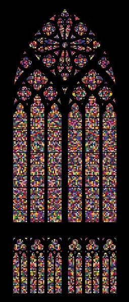
Fine 319: Gerhard Richter and the Cologne Cathedral


gerhardrichterscolognecathedralblog.jpg

Source


Gerhard Richter, born in 1932, is a contemporary German artist that primarily works in the medium of painting. Many of his works are a reaction to photography; he will project a photographic image on his canvas, trace it out and paint it in accurate colours, and then manipulate the still-wet pigments with soft brushes and squeegees. The results are images that look very similar to photographic blurs, while showing the artist's hand and revealing the nature of the paint itself. His manipulation of wet paint extends to his abstract works, where he paints many layers of colours on a canvas and scrapes it away, revealing the many layers underneath and blurring the colours together.


In 1974, he produced a series of canvases which explore colour. Similar to the works of Ellsworth Kelly, he painted squares of pure colour of a huge breadth of shades and hues in a grid formation, randomly arranged. The result looks like a pixelated image:


4096 Colours (1974)


"4096" is, of course, 16x16x16, and is the hexidecimal system of colours, used in computers.


30 years later, he was commissioned to replace the glass in the Cologne Cathedral's main window; during the Second World War, its stunning stained glass was shattered during Allied bombings of the city. This is what he delivered:


From the NY Times:


an abstract composition of 11,500 identically sized units — at 14.5 square inches each, they are frequently compared to pixels — in 72 colors, the arrangement of which was determined randomly by a computer program. Richter originally produced two drafts for the window, each portraying the Nazi execution of innocents. But he ultimately concluded that “figurative” was something he simply could not do. “I was not able to make something of it,” he says. Any representational image would have been tiresomely dissected for meanings religious, political, symbolic. There were also more mundane reasons. As the cathedral’s master builder, Barbara Schock-Werner, writes in a catalog essay for the window, “How could such a depiction be realized other than in gloomy, oppressive colors?” This was not a frivolous matter of interior decoration but a practical concern: the prismatic 1,200-square-foot window would bathe the cathedral (and congregation) in a significant amount of light.

So Richter, who provided the work as a gift, ultimately settled on a design inspired by his 1974 work “4,096 Colors” — one in a series of abstract color-field paintings he has worked on in various forms since 1966. About his process he noted: “I had the shape of the cathedral window, and I laid it on a color-field painting, and I said: ‘My God! Fantastic.’ I thought, This is the only thing.” Still, he did nod to architectural history, coordinating his palette with the existing windows — anemic hues were avoided — and forcing his modernist grid to submit to the Gothic tracery. The result is a mesmerizing, kaleidoscopic blend of technology and tradition.

I must say I'm quite glad that he limited his palate. But my feelings for the piece are mixed -- something I find odd, because I love his other works and tend to have a fiery passion for abstraction. On one hand, I feel the piece is inappropriate for the space. A majestic Gothic cathedral, full of skilled details, next to a randomly generated image from a computer. The juxtaposition of skill is jarring, and (dare I say it?) reveals Richter's work as lazy. I'm also not sure if the shapes themselves complement the curved lines of the building. It almost hits of an obnoxiousness of minimalism: "I can get away with doing barely anything".


But then I thought about it. I imagined the light shining through in a kaleidoscopic rainbow, bathing me in coloured light as I gaze up. These stained glass windows are to inspire a sort of awe; the beauty of nature, of light, of colour, that God gave us. The beauty of His creation. Richter forces us to view his composition not as a composition, but simply as colour and light. It is pure. It doesn't need the artists' hand: even at random, it is beautiful. Richter is a man of few words, but I wouldn't want him to say anything about the piece. Like the skilled tradesmen that created the original stained glass window, he should not take any authorship of this piece. The credit goes to God, and his splendour of colour and light -- and I'm an atheist.

Wednesday, February 17, 2010

Fine 319: Richard Serra/Before the Post-

Richard Serra's One Ton Prop thrills me. I've always liked the concept of the sublime, and I think that this piece really captures it in a very simple way. No illusion of gazing off a cliff: simply four pieces of sheet metal (of course, it's Serra) that are barely balancing off of one another. This thing could fall on you if you got too close. J'adore.

But then we have the debacle regarding his 1981 piece Tilted Arc. Reading up on this, it got me thinking: a lot of Serra's public works are ugly. Not even sublime... just flat-out ugly. Of course that's besides the point --not even the point-- but it doesn't surprise me that a lot of people weren't on his side when the courts were debating the piece's removal. We're supposed to contemplate the 'thingness of the thing'. But what happens when the thing itself is ugly?

Compare this to Cloud Gate in Chicago. People love Anish Kapoor's 2004 sculpture; always taking pictures of it, surrounding it, laughing at it, hugging it. The difference between these pieces is the difference between Minimal Art and Post-Minimalism.

Minimal Art revelled in the ready-made, the factory-shipped, the found, the boring, and the sublime. Post-Minimalism takes stripped-down, clean aesthetics and transforms it into something else: rather than dogmatically avoiding any references or any notion of beauty, many of these Post-Minimalists have no fear of fixing something up to make it look better, or even alluding to the outside world. Cloud Gate was painstakingly polished to remove any trace of its construction, creating this otherworldly magical bean that seems to have fallen out of the sky. Its surface distorts images and creates a void, recalling metaphysical or spiritual ideas. People come up with all sorts of theories about what it "means" -- something that I'm sure many Minimal artists would be horrified at.

I've just started to read Lyotard's Post-modern Condition, and this evolution from the minimal to the post-minimal strangely recalls some of his theories of post-modernity. Minimal Art seemed to have a dogma, something that the Post-minimalists have shunned. Does this represent part of the post-modern rejection of absolutism and the embracing of pluralism? Hmm!

Saturday, February 13, 2010

Fine 319: More Chairs


One Hundred Spaces, 1997

Oh, Rachel Whiteread: how I adore thee. I love how she deals with spaces that we often ignore. It's melancholy and curious. Looking at these negative casts of the spaces underneath chairs, I feel like a child who has crawled under the furniture to hide from the world while giggling, listening to the adult conversations above and believing that no one knows we're there.

Whiteread's ability to deal with the forgotten extends from the playful to the poignant. I think the most accessible piece for wide audiences would be her Holocaust Memorial, Nameless Library. Revealed in 2000 in the Judenplatz in Vienna, it is a reference to the People of the Book, book burnings, and the plethora of knowledge that was wiped out by the Nazis -- a library that we will never have access to again.

Friday, February 12, 2010

Fine 319: IKB

Go here.

What a fabulous website!

Hex Triplet of IKB: #002FA7
RGB: (0, 47, 167)
HSV: (223', 100%, 65%)

Dry pigment in a synthetic resin

--> Ultramarine

[And blue urine the next day.]

Staring out Into the Void. What a wonderful dream of sky.

Monday, February 1, 2010

Fine 319: Madmoiselle


Joseph Beuys: I wonder if Lacan was a lagomorph.

Rrose Sélavy: How preposterous.

JB: Would you like some sugar in your tea?

RS: *achoo!*

JB: Oh, may God bless America.

RS: Danke. & oui, señor. Two lumps. Shall you have some in yours?

JB: No, I have some honey here for me.

(An urban oak forest begins to sprout along the road. They drink out of gold tea cups.)

RS: What are your feelings on Wagner?

JB: He was probably a virgin, but with an animalistic urge. I heard he enjoyed wrapping himself in fat and felt.


What a lovely tea party.


Monday, January 25, 2010

Fine 319: Moira Roth

rothbook.jpg


Way back in high school, I was on the path to become a scientist -- but then I discovered Marcel Duchamp. Doing some research on Encarta 2002 (which was brand new at the time!) on some topic I don't even remember, I came across his name. "Du-champ? Who's that?" So I clicked on the name. Behold! A urinal!


Well, I was hooked from the beginning. After reading a few paragraphs, an epiphany occurred: "I get this." It was intuitive. Indeed, why must art be pretty? There is simply no need for it. Why can't an artist declare a urinal a piece of art, if he says so? Over a few short months, I read everything I could about Dadaism. As I said, I was hooked.


Fast forward a few years, and I'm a science student at UW. For my birthday, my (ex-)boyfriend bought me a book: Differece/Indifference: Musings on Postmodernism, Marcel Duchamp and John Cage. By this point, I was getting pretty sick of science, and found myself constantly on the internet, reading about art and culture... but I had never actually picked up a book. It all changed with this! A collection of essays, interviews and diary entries, Roth muses on the connection between Duchamp and Cage, as well as their impact on her research. Roth's expertise is on feminist and performance art -- areas very much influenced by Duchamp.


Coming across the various artists in Fine 319, I'm often thinking about the influence of Duchamp and Cage. So much so that I think I need to pull this book out again. I enjoy Moira Roth's writing style: very little jargon, very personal, and just a great read. I haven't looked up any of her other works since; perhaps there are some recommendations out there?

Friday, January 22, 2010

Fine 319: Trees and Chairs

Joseph Kosuth's One and Three Chairs I think is an excellent example of conceptual art to use for beginners. It's so concise, so easy to explain, and so much fun. It has it all: found objects, the use of text, playing with mental images, and easily reproducible. You could do it with any object and get the same result.

Which makes me think: why a chair? I can come up with a few reasons. First off, a chair is pretty ubiquitous in global culture. Every society has a variation of a chair; yet this particular chair he uses is distinctly Western. You can define a chair, yet there are still variations. A chair is also a rather tactile object: you use it for no other reason than to sit, and simply thinking of a chair conjures up feelings in your body. They're also everywhere -- and yet an object we don't always think of. And of course, there's the property of the chair itself. Easy to transport, a mid-size object that stands up by itself, you don't need to build a shelf to display the piece, nor is it so large that you need to scramble to find a space to place it. And what about the word itself? A simple word that is easy to pronounce, with no trick spellings.

Let's compare that to another conceptual piece with some similarities: An Oak Tree by Michael Craig-Martin.


A pamphlet argues that the glass of water displayed is, in fact, a fully grown oak tree. The text is as follows:

Q. To begin with, could you describe this work?

A. Yes, of course. What I've done is change a glass of water into a full-grown oak tree without altering the accidents of the glass of water.

Q. The accidents?

A. Yes. The colour, feel, weight, size ...

Q. Do you mean that the glass of water is a symbol of an oak tree?

A. No. It's not a symbol. I've changed the physical substance of the glass of water into that of an oak tree.

Q. It looks like a glass of water.

A. Of course it does. I didn't change its appearance. But it's not a glass of water, it's an oak tree.

Q. Can you prove what you've claimed to have done?

A. Well, yes and no. I claim to have maintained the physical form of the glass of water and, as you can see, I have. However, as one normally looks for evidence of physical change in terms of altered form, no such proof exists.

Q. Haven't you simply called this glass of water an oak tree?

A. Absolutely not. It is not a glass of water anymore. I have changed its actual substance. It would no longer be accurate to call it a glass of water. One could call it anything one wished but that would not alter the fact that it is an oak tree.

Q. Isn't this just a case of the emperor's new clothes?

A. No. With the emperor's new clothes people claimed to see something that wasn't there because they felt they should. I would be very surprised if anyone told me they saw an oak tree.

Q. Was it difficult to effect the change?

A. No effort at all. But it took me years of work before I realised I could do it.

Q. When precisely did the glass of water become an oak tree?

A. When I put the water in the glass.

Q. Does this happen every time you fill a glass with water?

A. No, of course not. Only when I intend to change it into an oak tree.

Q. Then intention causes the change?

A. I would say it precipitates the change.

Q. You don't know how you do it?

A. It contradicts what I feel I know about cause and effect.

Q. It seems to me that you are claiming to have worked a miracle. Isn't that the case?

A. I'm flattered that you think so.

Q. But aren't you the only person who can do something like this?

A. How could I know?

Q. Could you teach others to do it?

A. No, it's not something one can teach.

Q. Do you consider that changing the glass of water into an oak tree constitutes an art work?

A. Yes.

Q. What precisely is the art work? The glass of water?

A. There is no glass of water anymore.

Q. The process of change?

A. There is no process involved in the change.

Q. The oak tree?

A. Yes. The oak tree.

Q. But the oak tree only exists in the mind.

A. No. The actual oak tree is physically present but in the form of the glass of water. As the glass of water was a particular glass of water, the oak tree is also a particular oak tree. To conceive the category 'oak tree' or to picture a particular oak tree is not to understand and experience what appears to be a glass of water as an oak tree. Just as it is imperceivable it also inconceivable.

Q. Did the particular oak tree exist somewhere else before it took the form of a glass of water?

A. No. This particular oak tree did not exist previously. I should also point out that it does not and will not ever have any other form than that of a glass of water.

Q. How long will it continue to be an oak tree?

A. Until I change it.


In Kosuth's piece, each of the three representations match. In Craig-Martin's work, they obviously do not. Yet what we are confronted with is the nature of reality, of sensory experience, and the authority of the written word, the artist, and even of God. Craig-Martin is referencing transubstantiation; this bread is the body of Christ, this blood is the blood. Why? Because I said so. Or, because of (insert theological logic here). How much faith do we place in the written word, or how often do we simply agree with whatever logic is presented to us, despite how dubious it actually is?

Thursday, January 21, 2010

Fine 319: Nova Scotia College of Art & Design

http://nscad.ca/en/home/default.aspx

(Expand on this post later)

Fine 319: Parameters and Kittens/Musing on "Anti-Form"

Minimalism/post-minimalism/Minimal Art/process art -- whatever you want to call it -- tickles my fancy. In particular, I'm intrigued by "process art" and its emergence in a variety of art forms. In this class, we briefly touched on the works of Robert Morris, and when we did, I immediately connected the dots with some of my favourite 20th century composers: John Adams, Steve Reich, Michael Nyman.

Their concepts are quite similar: set up a process, create the parameters of it, and let it go. Sit back and enjoy the tumbling dominoes.

This seems to be to be an evolution of John Cage's experiments in chance, but with a different flavour. While Cage would create pieces that were utterly random at points, seemingly chaotic, these composers strike me as more... how to put this? Mathematical? Tight? Patient? I'm not quite sure of the word to use here. What I'm trying to get at is that Cage took a more Dadaist delight in confusion and entropy: what sounds from the audience will emerge during a performance of 4'33"? These process artists, on the other hand, seem to be interested in complex patterns and the recombination of them. I'm imagining a puzzle. Someone like Reich would take a puzzle and try to make it into as many different combinations as possible, seeing what new forms will come out of it. Cage, on the other hand, would take the pieces and let a kitten with a blowtorch and a plastic bag of new pieces loose on them. Some pieces would be lost, some cut up, some burnt, and new ones added. It's a new combination of what we saw before, but changed by chance and nature. Reich would create parameters for the piece to play within. Cage would prefer to have no parameters at all, and see what happens.

So to get back to Robert Morris, I think he's much more of a Reich man than a Cage one. Take a piece of felt, slash it a few times, hang it up on a gallery wall, and see what shape comes out of it. How is this not Cageian? We're anticipating gravity, a sterile environment, and that it will return to a state of equilibrium if someone happens to touch it. I think the point would be lost, or at least the meaning of the piece vastly changed, if we were to let loose the blowtorch-kitten on it. Why? Because the parameters have been altered.

If anything, Morris' anti-form seems to me to be a celebration of the mathematical precision and predictability of the universe. "Isn't it amazing all the natural processes out there and how they effect us?" he seems to be asking.
Cage seems to be a celebration of the chaos and unpredictability of the universe. "Isn't it neat how things can blow up sometimes when you least expect it?"

Wednesday, January 20, 2010

Fine 319 Journal: The Commercial Legacy of Abstract Expressionism


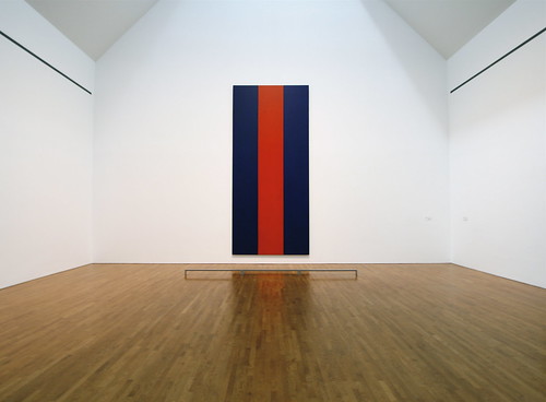
Voice of Fire
Barnett Newman, 1967

As we all know, when the National Gallery of Canada purchased this piece in 1989 for $1.8 million, controversy erupted. How could they spend so much money on a canvas covered with three acrylic stripes?

I have very mixed feelings around both the controversy and the price itself. Indeed, two million dollars for a painting is ridiculous. How much did this piece cost to produce? A few thousand, at most? Let's say, for simplicity's sake, $1800. That's a ten thousand percent mark-up. And for what? Some paint on a stretched piece of cloth?

What we have come to here is a discussion of value. How do we value art? Can we place a commercial value -- a price -- on art, and what we value about it? I believe it is fair to say that in the late 20th century, the art market went a bit haywire. Never before have we seen such inflated prices for artworks, or people purchasing art as an investment. When Japanese businessman Ryoei Saito purchased van Gogh's Portrait of Doctor Gachet for $82.5 million in 1990, did he purchase it for his aesthetic appreciation of it? Did he purchase it to hang in his home or business, for people to appreciate and enjoy? Or did he purchase it as collateral -- to get himself out of financial troubles when he lost his money a few years later with the Japanese bubble burst? (No one knows where the painting is now. He sold it to an anonymous buyer when he went bust.)

Trying to assign monetary value in a post-capitalist society to works of art, often made before this period, is trouble waiting to happen. Did van Gogh expect his Irises painting to fetch over a hundred million dollars sometime in the next century? Of course not. But a more interesting question is whether he would approve. If you spoke to any artist in the late 19th century, what would their reaction be? I choose this period because it one that exists after the invention of the museum (yes, the invention) and after the 'art world' began to take off, yet before the hyper-inflation and use of art as a commodity. My bet is that van Gogh would be horrified.

So what is an artist to do in such a climate? You could join it and make 'commercially viable' pieces to sell; make a living out of selling your pieces, hoping to make it into the upper echelons of the likes of Satchi. Or you could rebel, and make pieces that are impossible to sell. How do you sell a performance? How do you sell an installation piece that will be destroyed once the show is over? What about a plot of land? A hill? A building covered with fabric?

Has Modernism Failed? is an intriguing book by Suzi Gablik, written in 1984, a time when the art world seemed lost and directionless, with no guiding moral authority and no bloody point. Beauty was no longer a concern -- abstraction had erased that point. But we could go no further with abstraction. How do you go further than an monochrome canvas? Even moving off a canvas entirely was done. A single action could be declared art. And if everything is art, then nothing is. But if everything is art, then why do some pieces fetch millions, while others are left to the wayside? How can anyone own a piece of art, if art can be a naked woman reading poetry out loud while covered in chocolate? How can you own what is un-ownable?

I think what my wandering thoughts have lead to is a recognition that the hyper-inflation of the art market is simply ludicrous. Then again, we all know this. This discussion has lead nowhere. Without boundaries laid out between what is art and what is not, and what art is valuable and which isn't, we are lost. John Carey has something going on when he asks:

Tuesday, January 19, 2010

Fine 319: The Sunset Strip

Something I'm curious to look into is Edward Ruscha's Every Building on the Sunset Strip's potential connection or reference to film culture and theory.

Is this a comment on the nature of film itself -- simply a series of flickering images that masquerades as a real-time re-presentation of reality? Furthermore, it is the masquerading of the Sunset Strip as the stuff of Hollywood dreams, when in fact the street is rather drab. This calls to mind Billy Wilder's masterpiece Sunset Blvd. (1951): the delusion/illusion of Hollywood, the everyday experiences of those that live there, how dreams are destroyed daily on the Strip, and all of this presented in a neo-Expressionist noir format -- an uneasy combination of Truth and Fiction.

Saturday, January 16, 2010

Fine 319: Schlegels

In class, we came across Andrea Schlegel's Toiletpapersofa. So, on google I go to find out more about this artist. And what do I find? "Do you mean Andreas Schlegel?"

Now, I'm confused. I can't find Toiletpapersofa anywhere. There is a young German artist named Andreas Schlegel, born in 1975 and who works in Singapore. But looking on his works, I can't find this piece anywhere. And I swear in class we were presented with the name Andrea, not Andreas. So is this a different person I've come across?

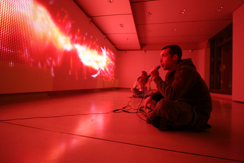
If it is, then he's damned interesting. Media arts are an area I'm not too familiar with, but it is something that I've had a strange pull towards. Schlegel, according to his website, likes to "write programs that generate audio, visual and physical output", often creating what he calls "Objects". These are machines that he builds and programs. One such piece is groundpulse (2009), a modified seismometer that measures vibrations and creates an audial output. I have a background in earth sciences, and initially came to university to become a seismologist or volcanologist -- so I am quite fond of this piece. I would like to learn more about this piece, as I have some questions: does the artist have the ability to manipulate the output? What kind of output is it: only audial, or visual, too? Is he interested in using this as an instrument that responds to the natural movements around it, or does he like to, say, jump around it or purposely create vibrations for it to respond to? Real Time Visuals (2005) is an LED wall that features visualizations which are generated in response to a connected electronic reed instrument (like a clarinet). Depending on which notes are played, the tempo, the dynamics, etc., new, nebulous computer-generated images are displayed. I think the possibilities are endless with this one; but once again, I would be interested to know if he prefers a more zen approach or an interactive one. Does he want to learn how to control which images are being displayed? Does he want to compose a 'film' of sorts -- play these notes, and this pattern of colours and images will emerge? Or is he simply content with people playing random notes at will, just seeing what will pop up in front of them?

Real Time Images, 2005
LED Wall

Friday, January 15, 2010

Fine 319: Richard Serra's "The Shift"

The piece we saw in class by Richard Serra in King City? Y'know, the bisecting concrete forms in a soy field?

I found better photos of it, and discovered that it actually does have a name, contrary to what the slide said!

Fine 319: Donald Judd

I don't know how much I like Donald Judd.

Which is strange, because I tend to adore minimal art. Richard Serra? Yes, please. Charles Ray's Pepto-Bismol box? I almost died from ardor when I saw that in class. But Judd? I don't know...

I'm having difficulties explaining why I don't like him. Then again, so far I've only seen what's been presented in class. So I'm off to do some google searching of images...

[10 minutes later]

Yeah. Judd just doesn't do it for me. A lot of his pieces strike me as cheap Ikea shelves or chairs, with a slight pompousness in their presentation. One of the reasons why I like Charles Ray so much is that he has a sense of humour to his work, like with the Pepto-Bismol. But at the same time, there are some other minimal artists that are equally sombre as Judd, yet I find their work extraordinary. What is it with Judd?

Thursday, January 14, 2010

FIne 319: To Read

This is a reminder to myself to check out ABC Art by Barbara Rose, from 1965. Jane has recommended it as a contemporary account of the beginnings of minimal art. It should provide a more personal 'feel' of the situation these artists were working in.

Checking out Trellis, it doesn't look like they have it. Plenty of other books by her, though: I may have to check out Autocritique: Essays on Art and Anti-art, 1963-1987. This title alone piques my interest.

Fine 319: Chocolate Gnaw


I loved the class reaction to Janine Antoni's Chocolate Gnaw. I wonder how they would react if they knew the rest of the details?

After chewing the chocolate, she spat it out and reconstituted them into heart-shape empty 'chocolate boxes'. And what about the companion piece, Lard Gnaw? Chewing on a 600-pound block of lard, and reconstituting the chewed lard into bright red lipstick.

I think these pieces are extraordinary: it hits you in the gut. It's so visceral -- I'd be surprised if there was anybody who didn't feel something after looking at this piece. It's so personal, so delicious.

It reminds me of the classic Surrealist piece, Meret Oppenheim's Fur Covered Cup and Saucer, from 1936. You can't help but recreate the feeling in your mouth when you see these pieces, and it's startling. If art is about communicating feelings, then these pieces are bang-on.


Tuesday, January 12, 2010

Fine 319 Research Journal

On this blog I shall be posting entries for my Fine 319 (Contemporary Art) Research Journal. It will be a venue for me to post about interesting artists and concepts we have come across in class, my meanderings about contemporary art, additional artists and pieces I have come across, and anything else that pops into my head from minimal art to the present day.

So, what topics will this cover? In no particular order, I'm anticipating:

Minimal Art

Post-minimalism

Conceptual Art

Performance Art

Hard Edge Painting

Neo-expressionism

Earthworks

Installation Art

And of course, discussions on late formalism, Abstract Expressionism, late 'modernism', and probably lots of Duchamp. (Please!) I think a blog is an interesting format to use for this project -- as I always carry my laptop with me around campus, this allows me to quickly jot down my thoughts whenever they magically appear in my head. I also quite enjoy researching online. I find myself constantly opening new tabs on my browser, ready to explore a vast array of topics and artists. This is how I discovered some of my favourites, such as Dan Flavin, whom I came across a number of years ago purely by chance. The interconnectivity of contemporary art and the myriad of references that is often distilled in many postmodern pieces means that I have to go find out just what these artists or critics are talking about. "Bürger? Who's that? I have to do a Google search!" "Lyotard? Maybe the library will have some journal articles."

And so, let's begin!